






Category
Brand Identity, Logo DesignAbout This Project
Future Spectrum Logo Design Rationale
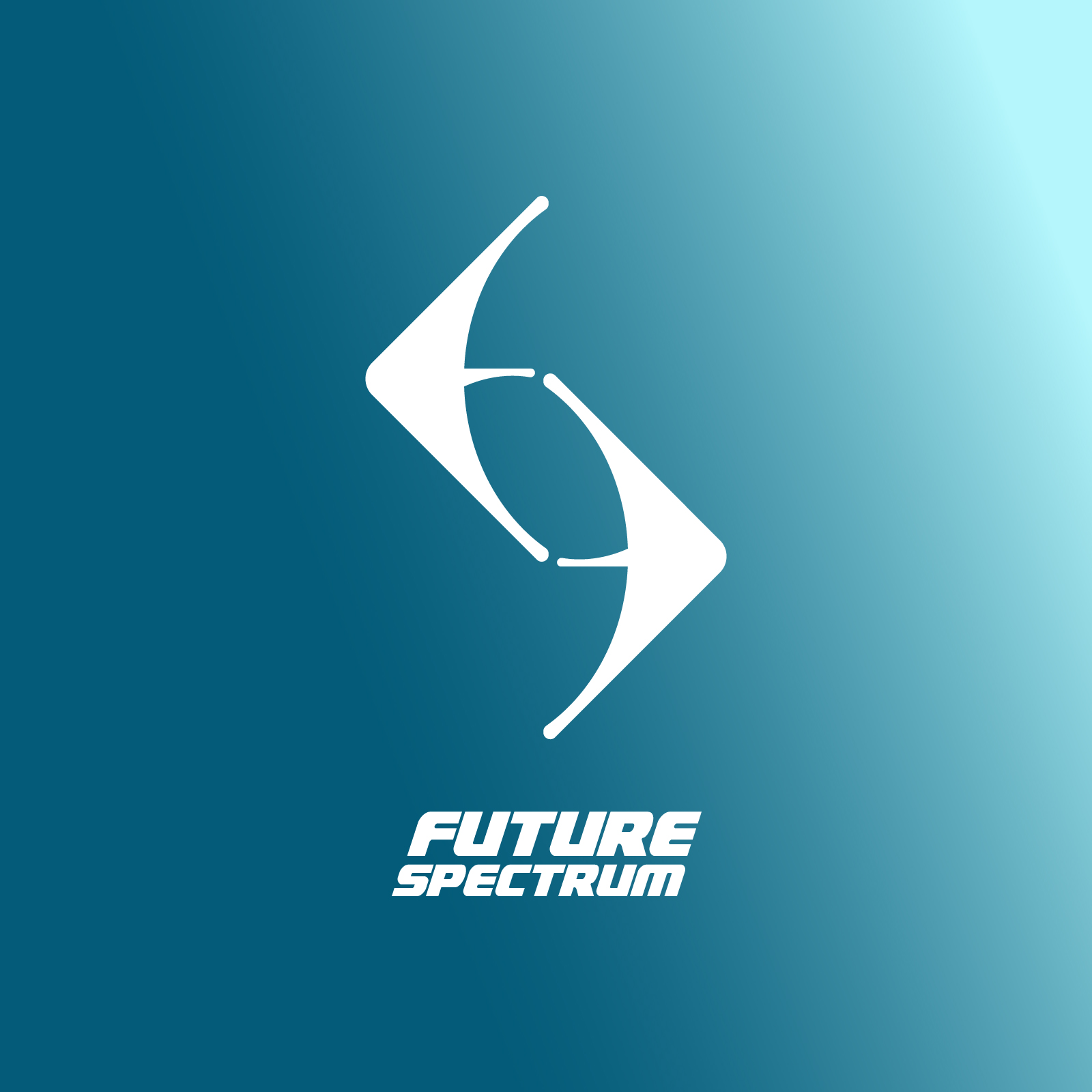
The Future Spectrum mark is built around a single abstracted shape that layers three meanings into one form:
The Letter “F”
The outer silhouette is drawn from an abstracted “F,” anchoring the mark to the brand name at its core.
Trade Arrows
Two opposing arrows are embedded within the shape, pointing inward and outward to symbolize the bidirectional flow of trade; goods and value moving both ways.
The Letter “S”
In the negative space between the arrows, an “S” emerges, completing the “FS” monogram for Future Spectrum without adding a single extra line.
The result is a mark that reads instantly as a dynamic, forward-pointing arrow at a glance, while rewarding closer inspection with the hidden “FS” monogram, reflecting a brand built on movement, exchange, and clarity.
Paired with the bold, geometric wordmark, the logo is designed to feel modern, precise, and confidently in motion, much like the trade networks Future Spectrum represents.